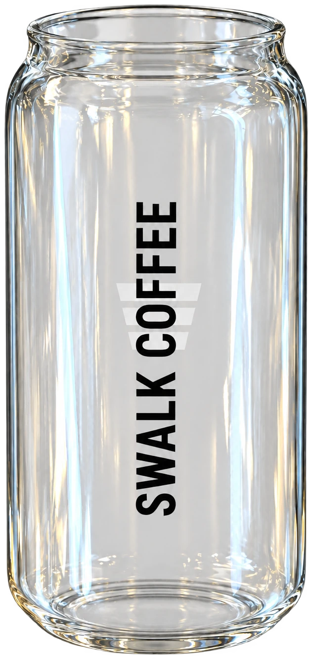
Cold drink cup
Clear, can-shaped glass. SWALK COFFEE set vertically on the side, the three-stripe symbol behind it.
Brand
Swalk Coffee aims to be more than a coffee brand: a place that fits into city life and where people can settle in comfortably.
01NAME
Swalk joins “street” and “walk”. The word also carries the kerb and the crossing with it. The name places coffee inside the walk rather than as a pause from it.
The line follows from there: The Rhythm of the City. The rhythm of traffic lights, footsteps, the morning crowd.
02SYMBOL
The symbol is drawn from a coffee cup. Three stripes narrowing downwards read both as the silhouette of a paper cup and as a pedestrian crossing.
The brand works in three colours: black (1E1E1E), yellow (FCD450) and white. On yellow the logo is black; on black it is white — a yellow logo on black is never used.
#1E1E1E#FCD450#FFFFFF03CUPS
The brand standard starts at the cup. Swalk has one cup for cold drinks and one for hot; both are defined in the guide and no store substitutes them.
Cup design is part of the franchise agreement: packaging comes from head office and stores do not print their own.
Clear, can-shaped glass. SWALK COFFEE set vertically on the side, the three-stripe symbol behind it.
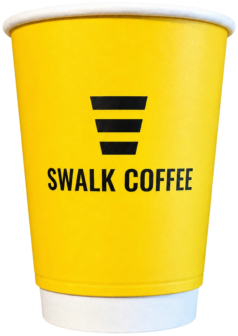
Yellow, double-wall paper. The black three-stripe symbol on the front with SWALK COFFEE below it.
04SPACE
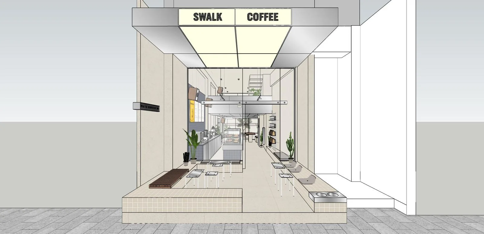
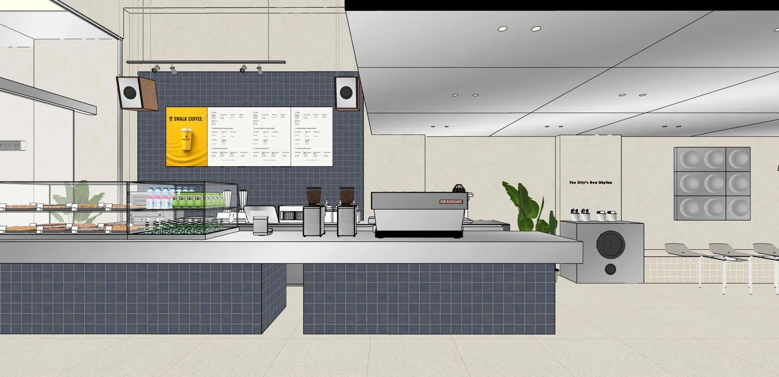
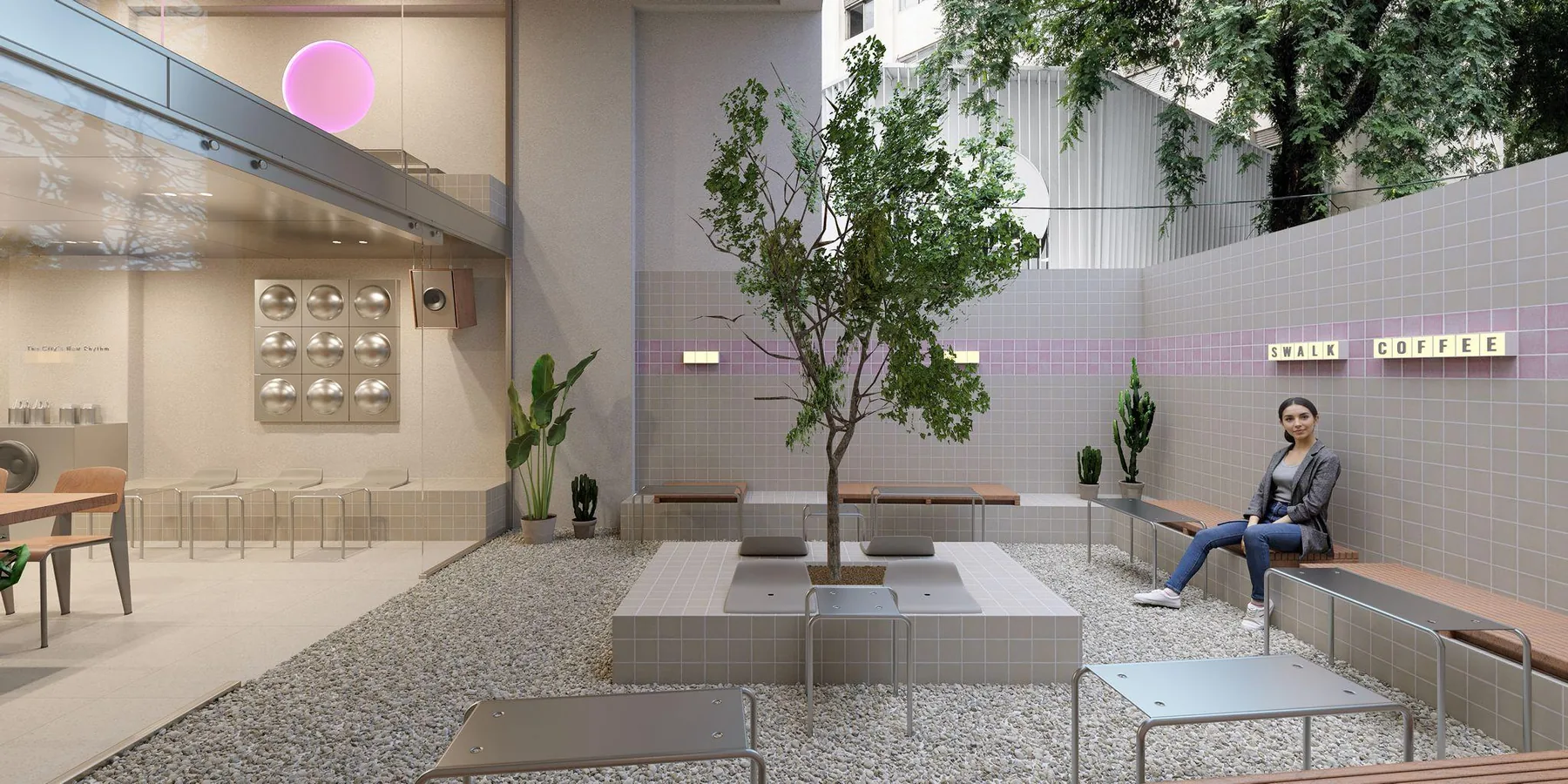
The architecture is built on repetition. Bar, service line, seating and outdoor area are separate modules; a change in square metres changes how many modules there are, not their order.
Material and form stay fixed: tiled surfaces, plain geometry, furniture without ornament, box-letter signage. A store takes its identity from its colour combination while the skeleton stays the same.
The images below are Bağlarbaşı concept renders.

05COFFEE
The bean takes the same journey; the roast decides its character. All three are named after the scale of the city.
Light roast
Less heat means the bean keeps its own aroma, oils and acidity. The character of the growing region — and the caffeine — stay intact.
Medium roast
A medium roast spreads acidity, aroma and flavour evenly, giving a sweeter profile than a light roast.
Dark roast
A dark roast pushes the oils to the surface, leaving it glossy. Dense and creamy in the body — the right bean for espresso.
06ELEMENTS
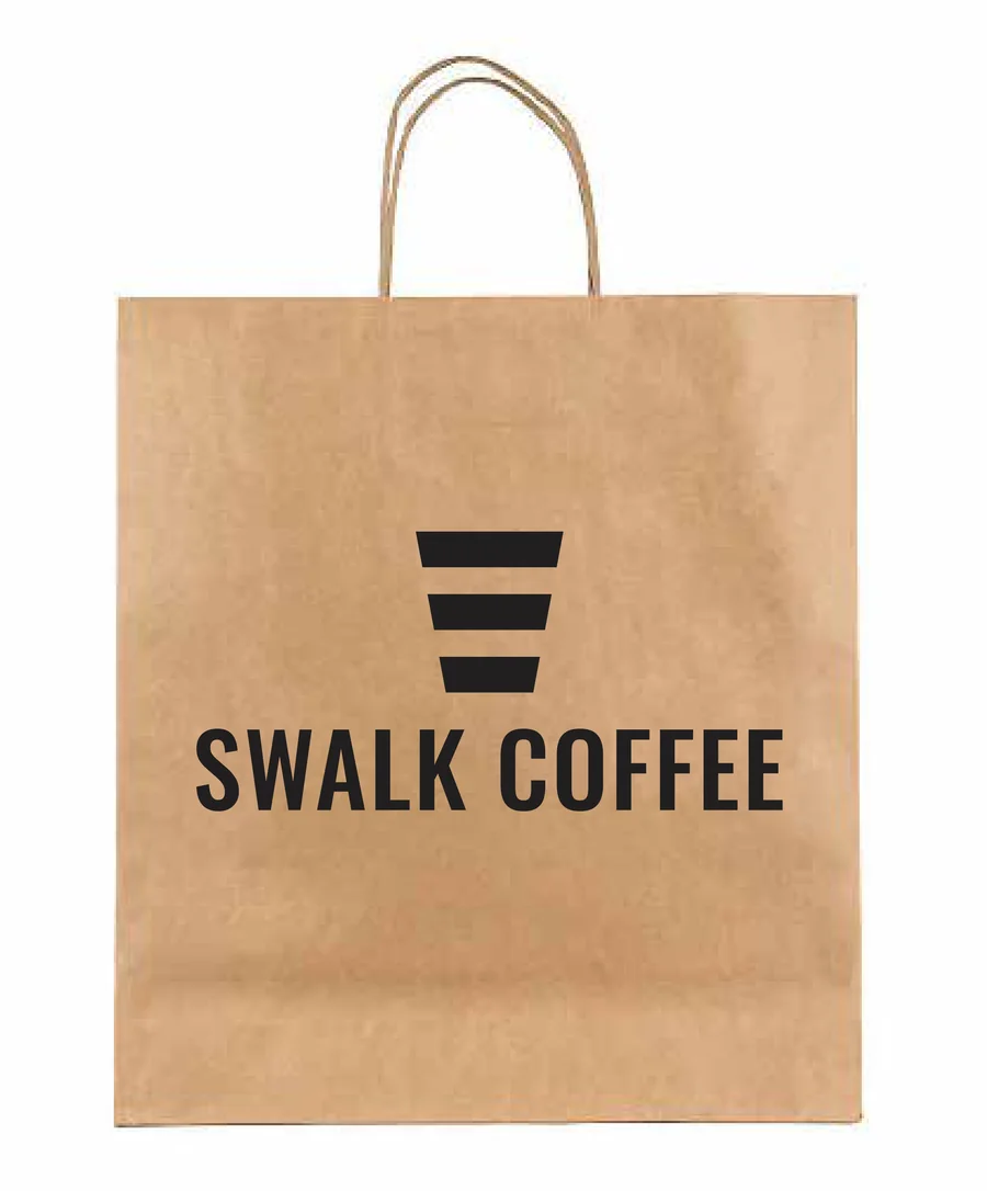
Everything beyond the cup follows one language too: kraft, black print, a single line of logo.
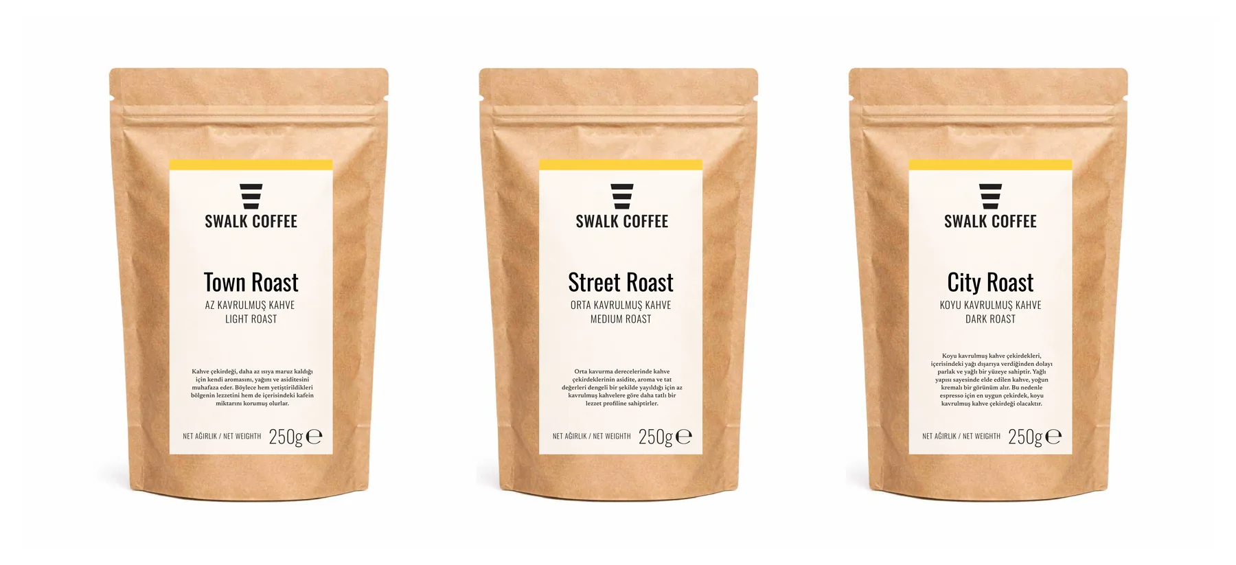
Town, Street and City Roast; kraft doypack, black print, 250 g.
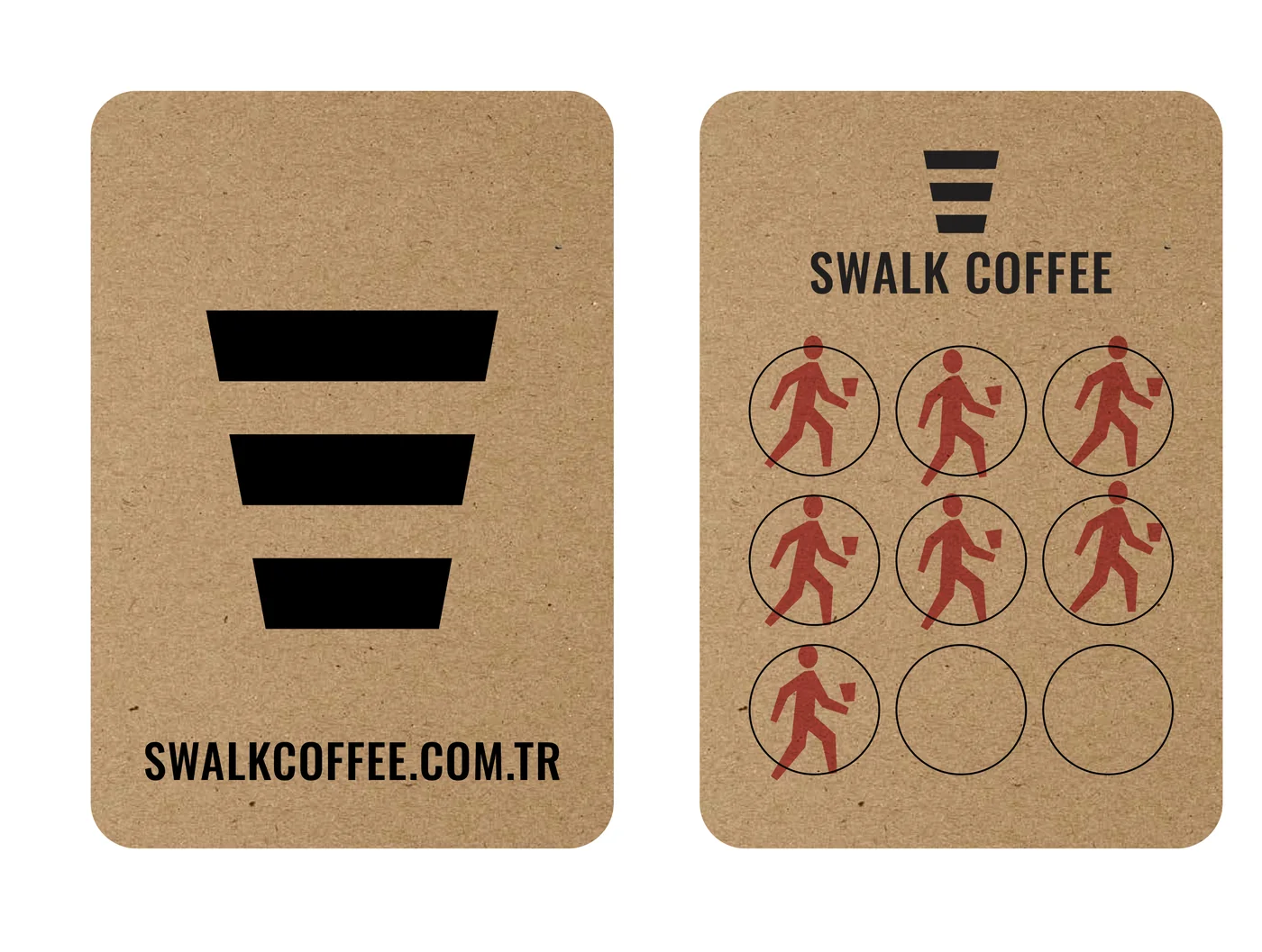
Kraft paper carrying only the symbol and the logotype.
A stamp with every purchase; a full card earns a cup of coffee.
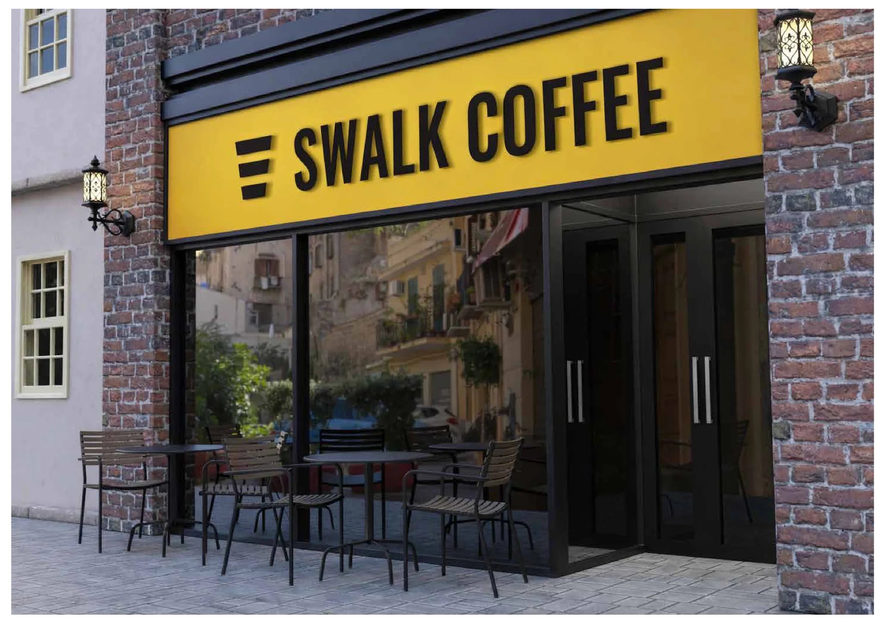
Box letters on yellow or black, logo on a single line.
07TYPE
Headlines and menus are set in Oswald: narrow, upright, made for signage.
Body text is set in Newsreader: a readable, warm serif that holds up on screen.
Visual identity: Noord Design
Oswald
SWALK COFFEE
Newsreader
Exposed to less heat, the coffee bean keeps its own aroma, its oils and its acidity.