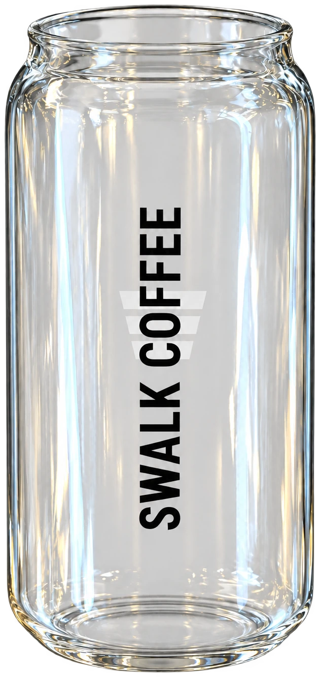
Cold drink cup
Clear, can-shaped glass. SWALK COFFEE set vertically on the side, the three-stripe symbol behind it. Every cold drink is served in this cup.
Istanbul · Est. 2026
Swalk Coffee started at a pedestrian crossing: step, pace, rhythm. The brand book is written, the architecture repeats, the digital platform is running. Now we are looking for partners in other corners of the city.
01BRAND
Swalk is “street” and “walk” pushed together. It also echoes sidewalk — the kerb, the crossing. The brand sits where those two ideas meet: a person walking through the city, coffee in hand.
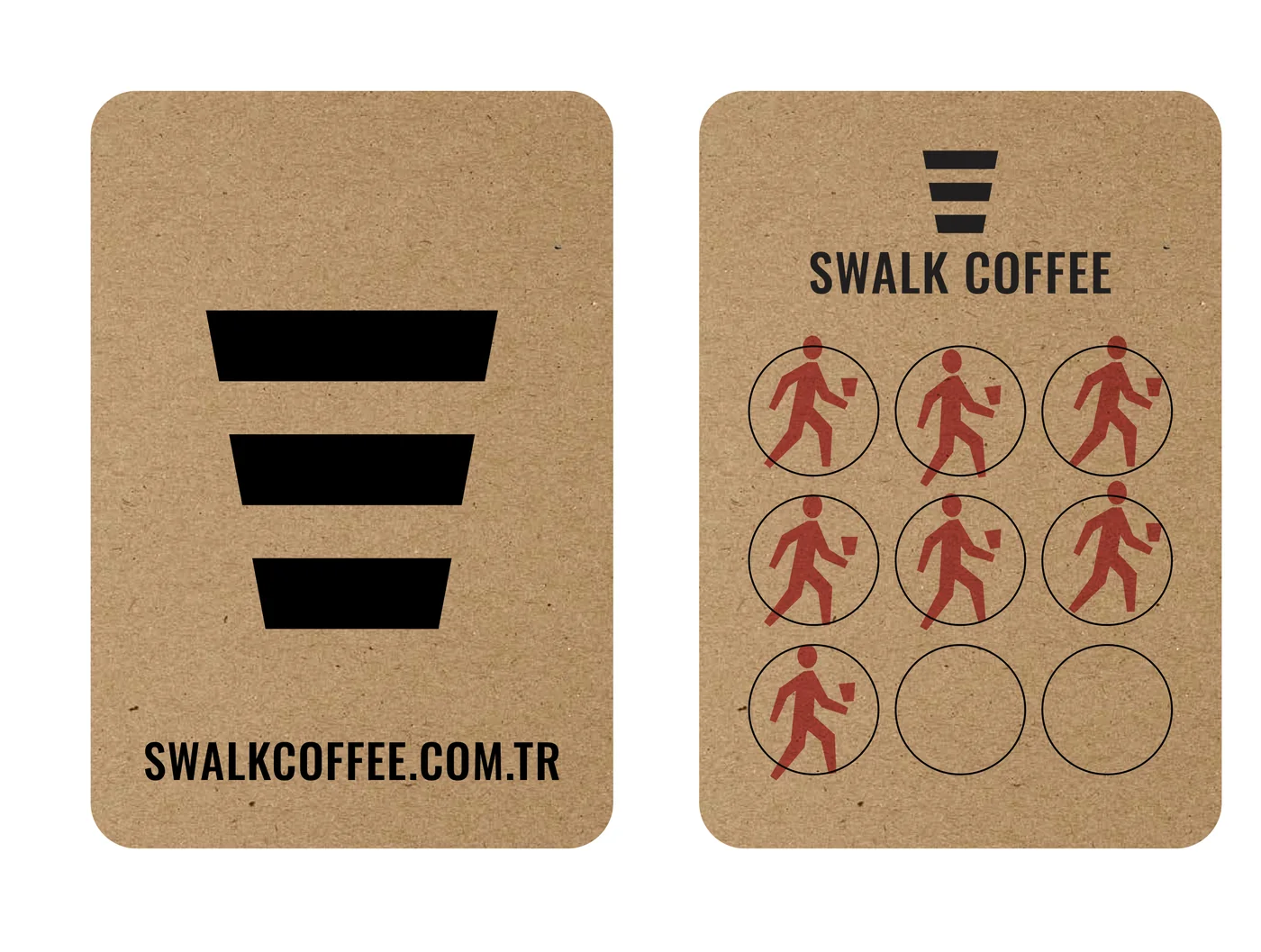
Our symbol is a coffee cup. Look closer and you see three stripes: a pedestrian crossing. The simplest possible sign for the rhythm of a city.
The brand runs on three colours: black, yellow and white. Nothing else.
02CUPS
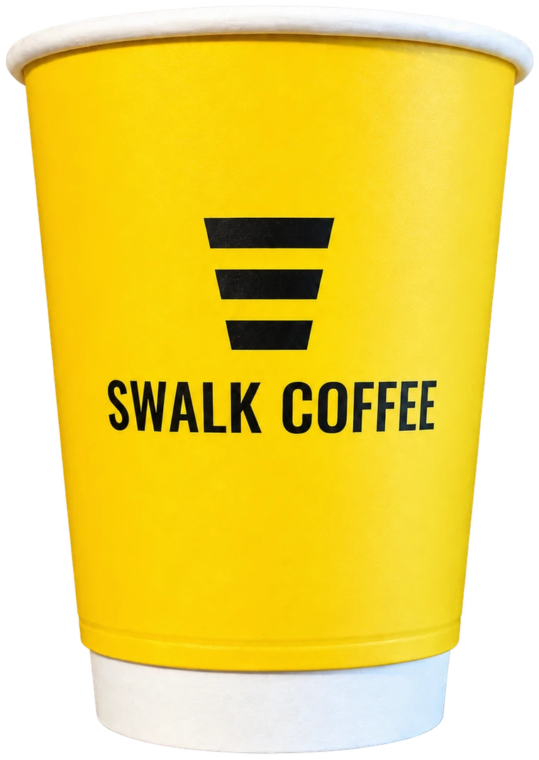
A customer meets the brand through the cup in their hand. That is why Swalk has exactly two cups; both are standard and no store changes them.
Clear, can-shaped glass. SWALK COFFEE set vertically on the side, the three-stripe symbol behind it. Every cold drink is served in this cup.
Yellow, double-wall paper. The black three-stripe symbol on the front with SWALK COFFEE below it. Hot drinks and lead brand imagery are built on this cup.
White paper cups, black cups, other plastic shapes and ceramic mugs fall outside the brand standard and appear in no image.
The rest of the brand system
03COFFEE
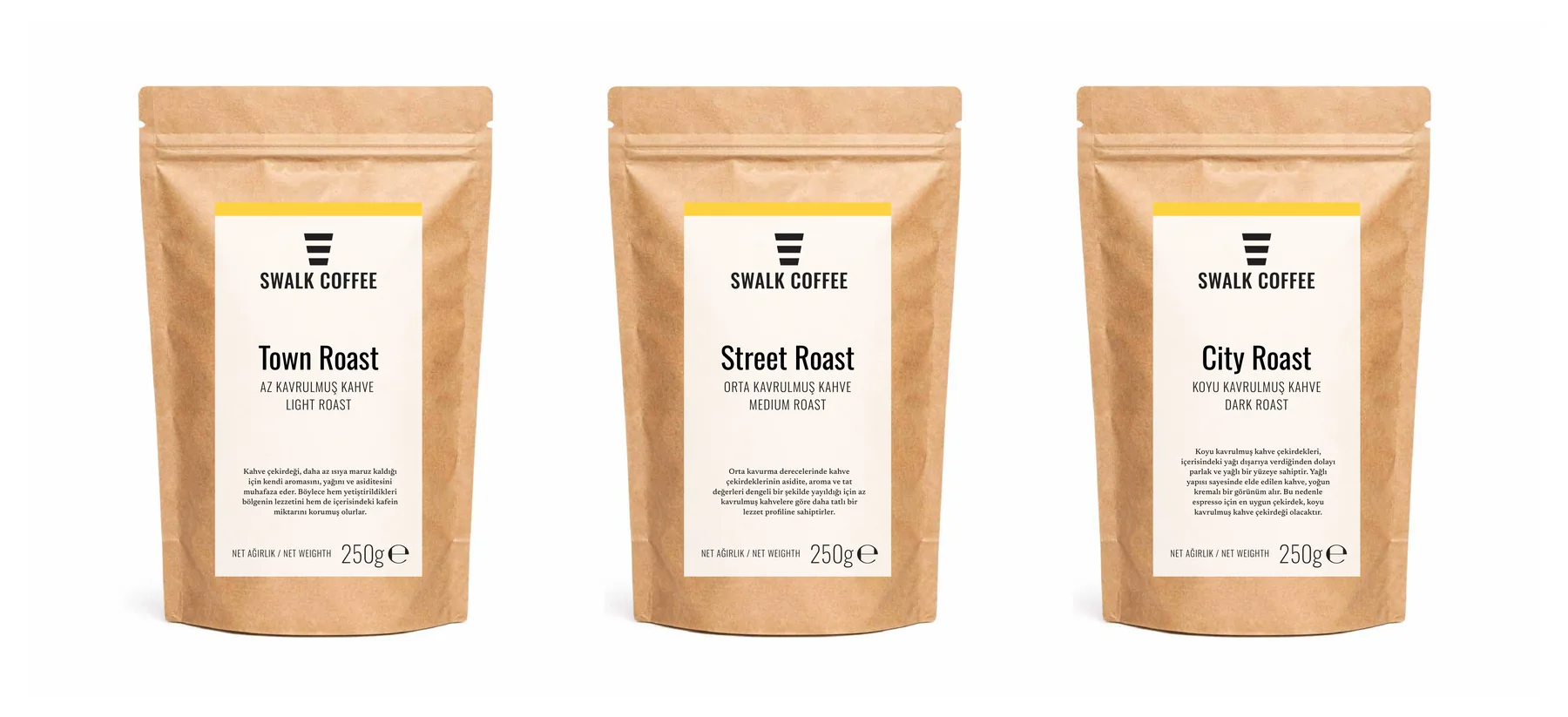
We named the roast levels after three tempos of city life. One bean, three characters.
Light roast
Less heat means the bean keeps its own aroma, oils and acidity. The character of the growing region — and the caffeine — stay intact.
Medium roast
A medium roast spreads acidity, aroma and flavour evenly, giving a sweeter profile than a light roast.
Dark roast
A dark roast pushes the oils to the surface, leaving it glossy. Dense and creamy in the body — the right bean for espresso.
04DRINKS
Espresso-based hot drinks, cold coffee, signature refreshers, milkshakes and Turkish coffee. Eight examples:
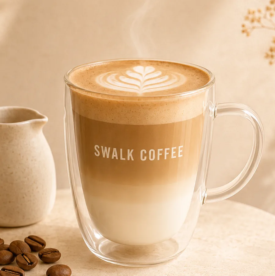
Latte
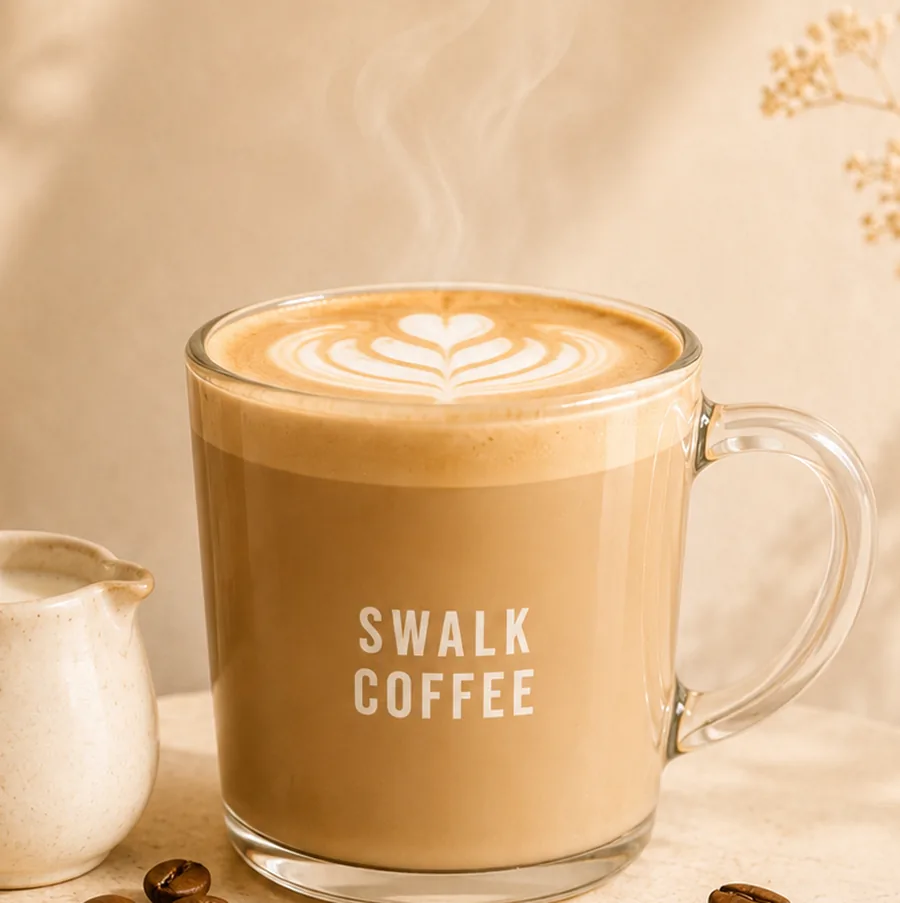
Flat White
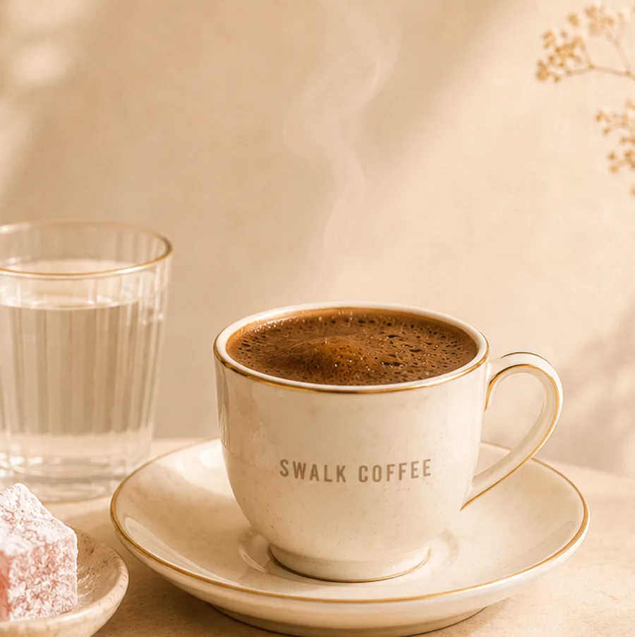
Turkish Coffee
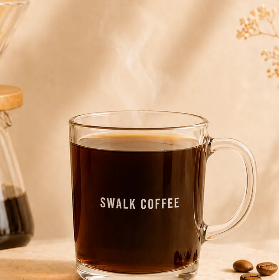
Filter Coffee
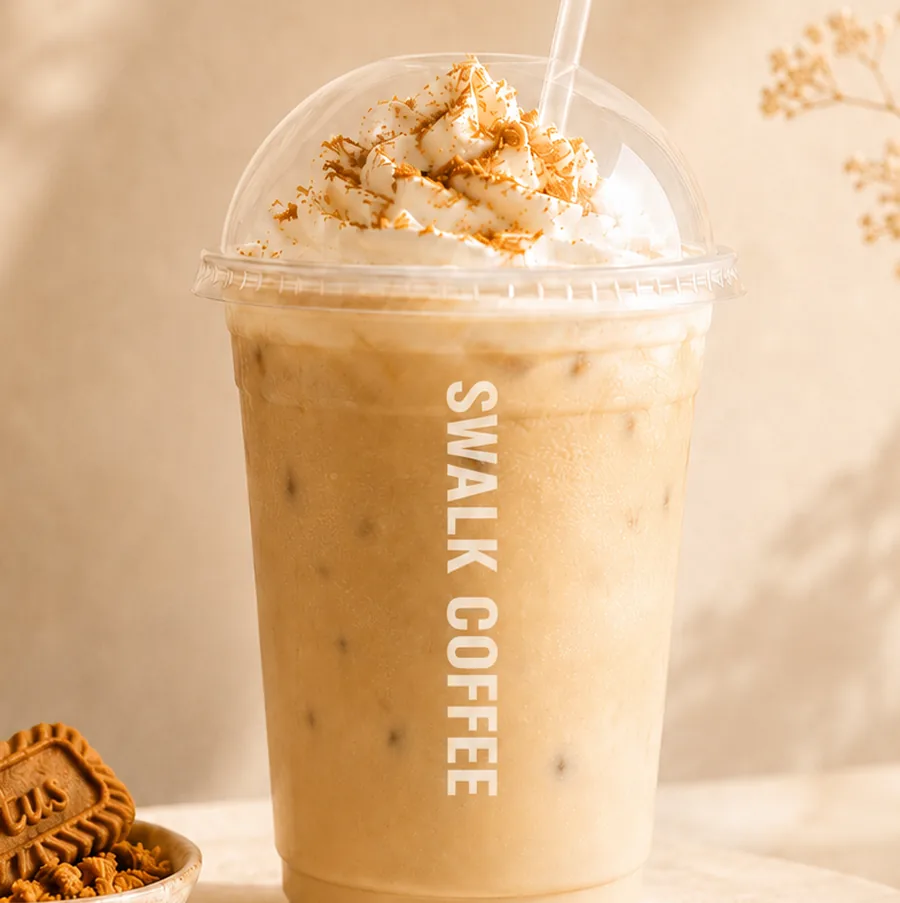
Ice Lotus Latte
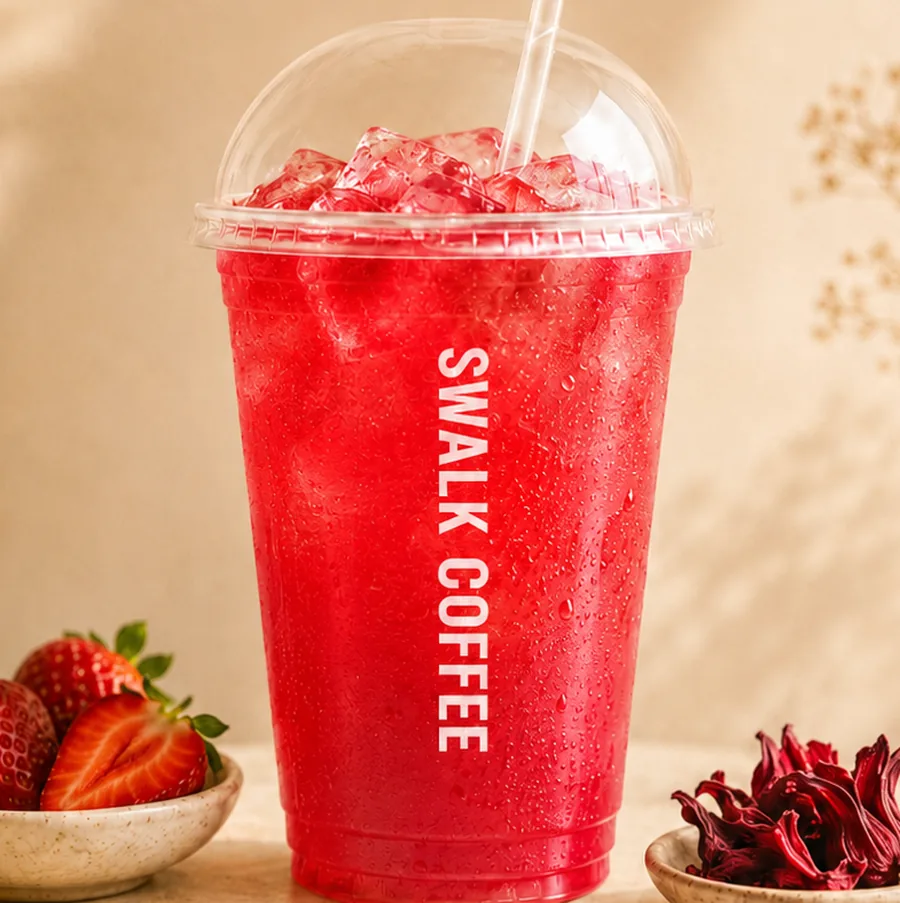
Strawberry & Hibiscus
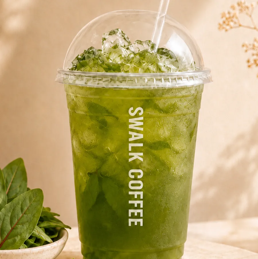
Sorrel Cooler
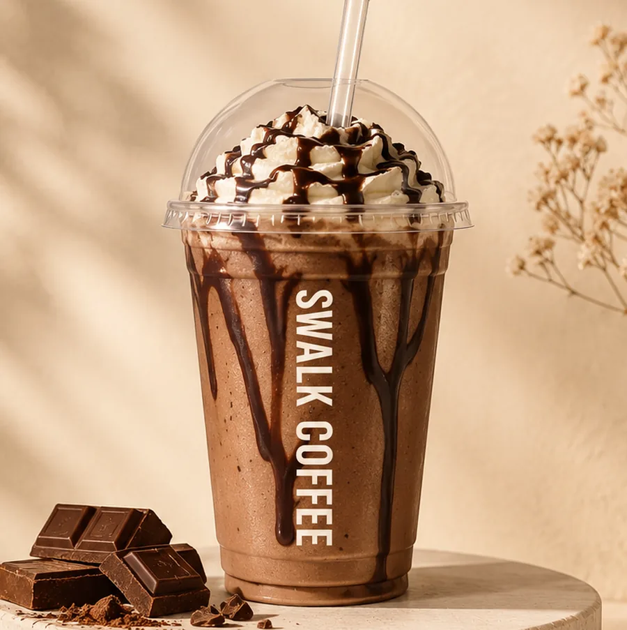
Chocolate Milkshake
These images show the range only; no prices, sizes or menu table appear on this site. Cup design follows the two official Swalk cups.
05SPACE
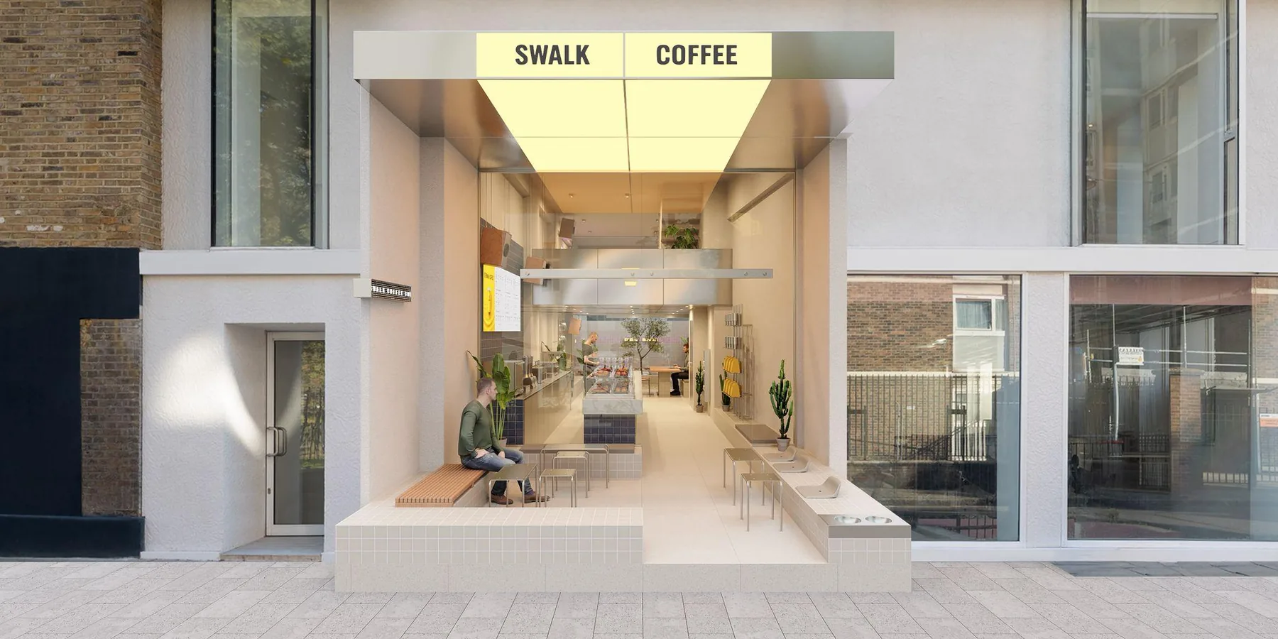
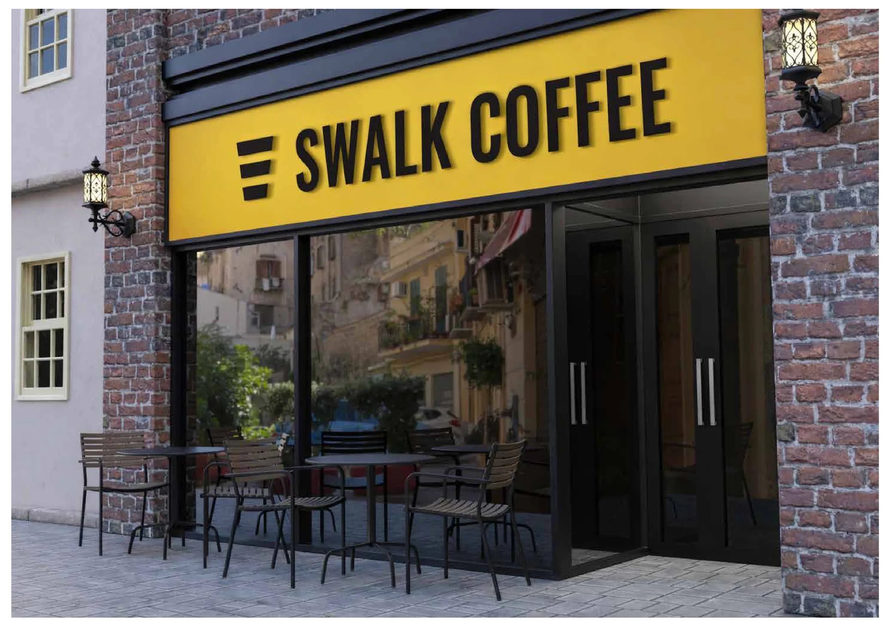
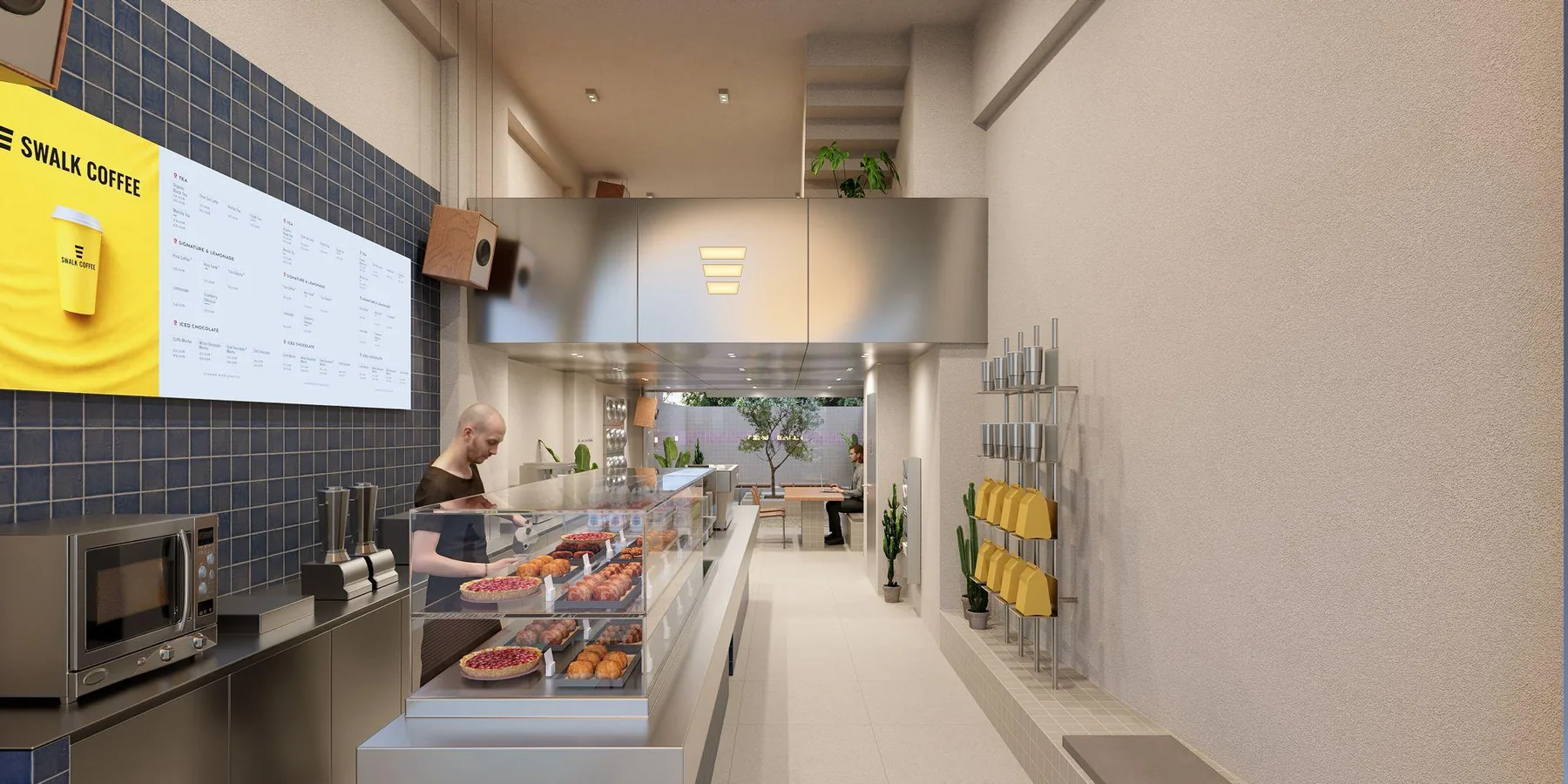
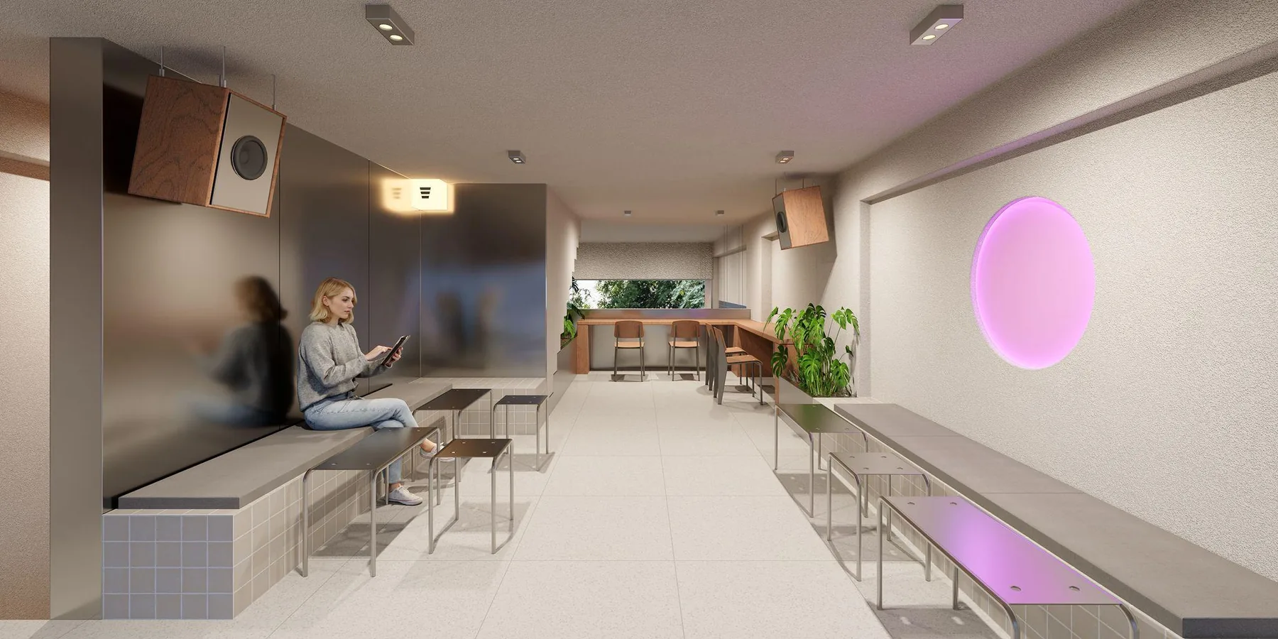
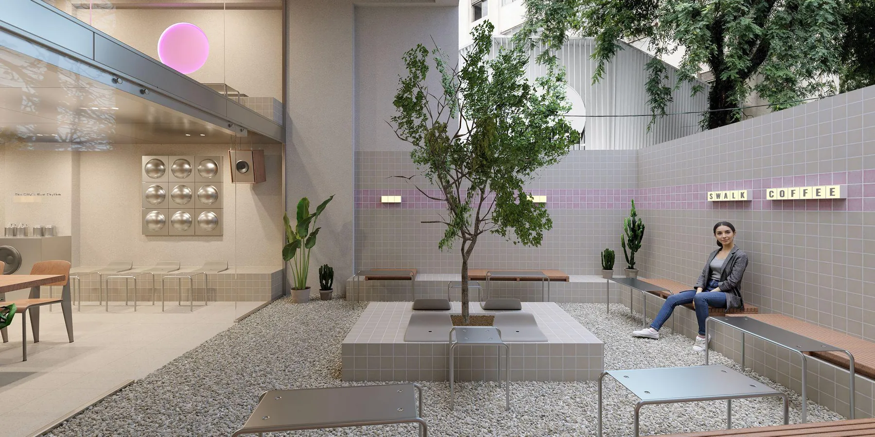
The concept was drawn as a repeatable system rather than one shop. Bar, service line, seating and outdoor area are separate modules; the square metres change, the sequence does not.
The material language stays fixed: tiled surfaces, plain geometry, box-letter signage and clear typography. A small grab-and-go corner and a large store with a courtyard tell the same brand story.
Bağlarbaşı concept renders
06DIGITAL
The brand lives on the phone as well as in the store. The app puts loyalty, payment and customer management in one place.
Screenshots taken from the Swalk Club app.
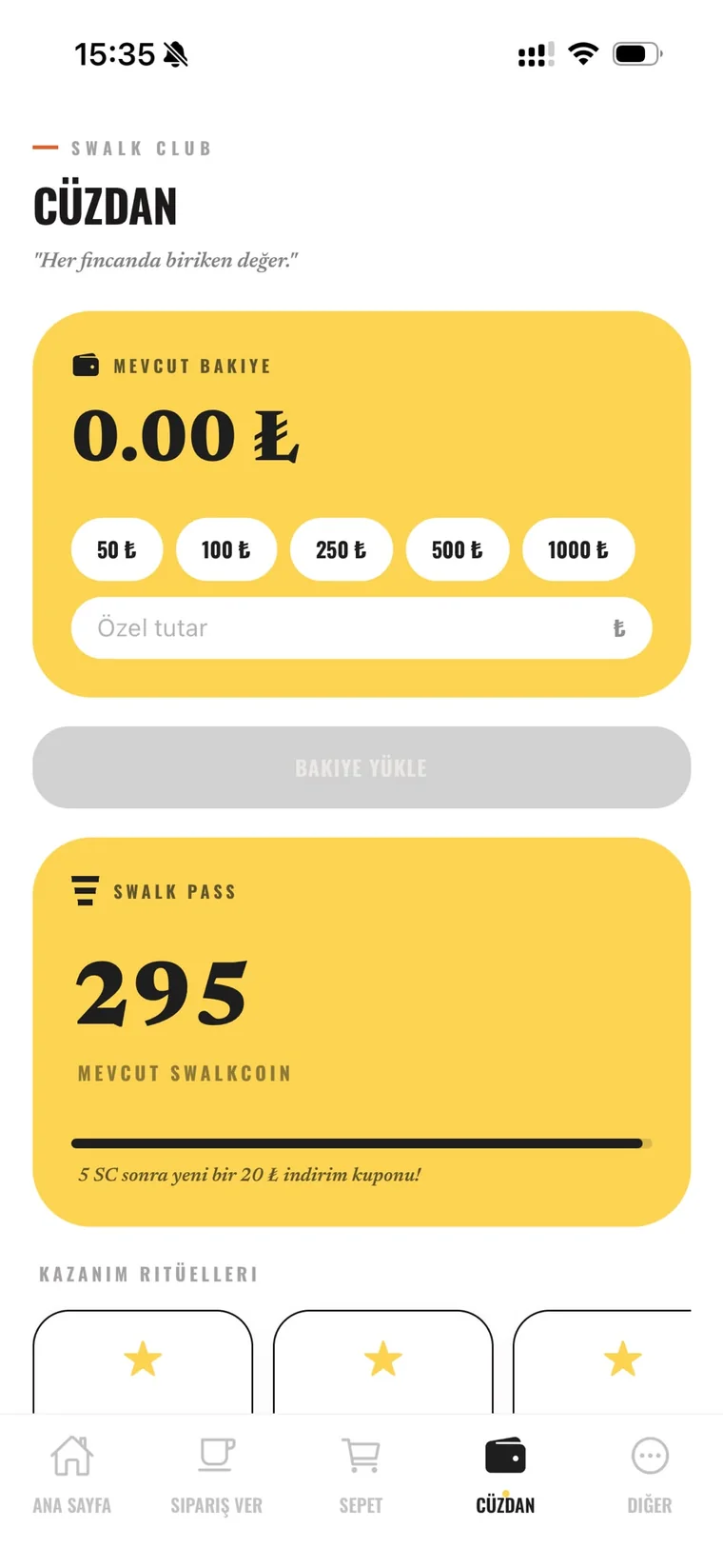
Customers top up in the app and pay at the counter with their phone.
Every purchase earns SwalkCoin. Points turn into discount coupons.
Repeat behaviour is rewarded, so the customer comes back to the same corner.
Customer data and campaigns run from head office. A store never has to invent its own marketing.
07FRANCHISE
Swalk Coffee was built for multiple stores from day one: a written brand standard, repeatable architecture and a running digital platform.